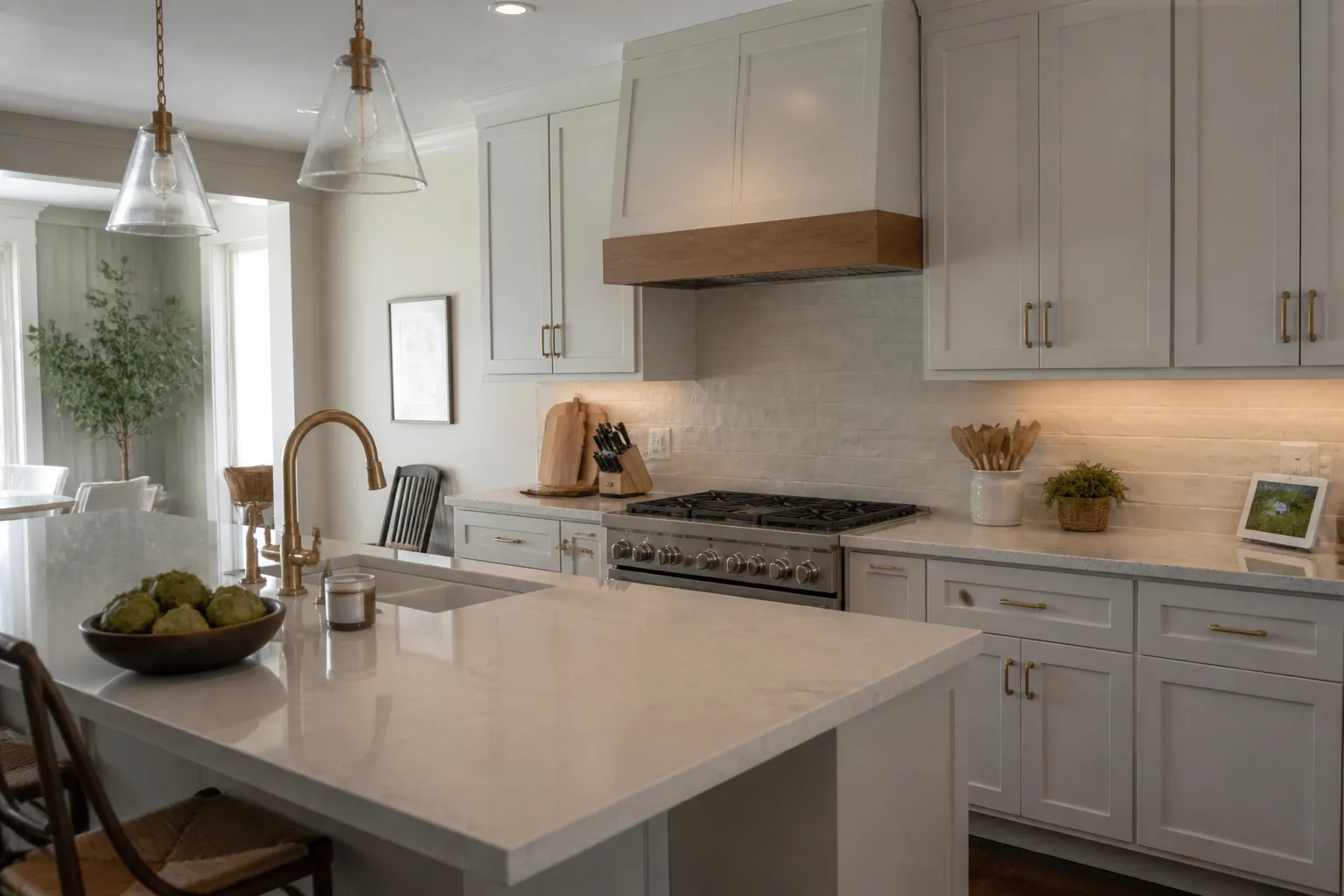
Marietta Countertops helps homeowners and businesses across Marietta, GA choose, fabricate and install the right countertop. Countertops and cabinets take up a large share of the visual space in a kitchen. A good match does not require identical colors. It requires an intentional balance of undertones, contrast, pattern, and light. Seeing real samples together is more useful than choosing from a screen.
Start with cabinet undertones
White cabinets can lean warm, cool, or neutral. Wood cabinetry may carry yellow, red, gray, or brown undertones. Hold countertop samples directly against the cabinet door to see whether the colors feel harmonious in the same light. A countertop with a conflicting undertone can make a planned combination feel accidental.
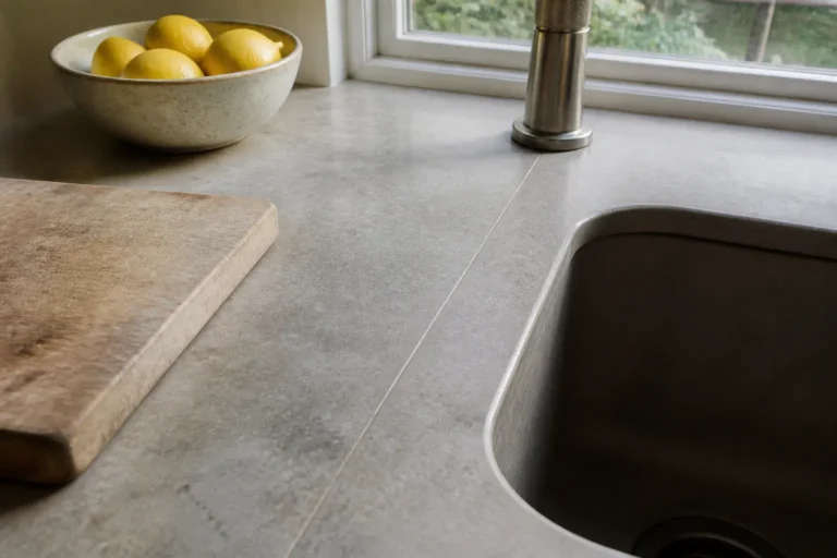
Do not rely only on color names. “White” quartz can have cream, gray, blue, or beige movement, and natural stone can include subtle minerals that become more visible in a larger slab. Look at samples near a window and under the lighting you will use in the evening.
Choose a contrast level
Light counters with dark cabinets create clear contrast. Darker counters with light cabinets can anchor the room. A low-contrast combination feels softer and more continuous. Each approach can work when the backsplash and flooring support it.
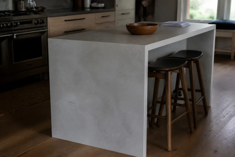
Consider the visual weight of the island separately. An island is often a place to introduce contrast while keeping perimeter counters quieter. Alternatively, matching all counters can create a calmer design. Decide what you want the eye to notice first when entering the room.
Balance pattern and texture
If cabinet doors have a pronounced grain or the backsplash is busy, a quieter countertop may keep the room from feeling crowded. If the cabinetry is simple, a naturally veined stone or patterned quartz can become a focal point. Hardware, open shelving, and lighting should be part of the same visual balance.
Look at samples in your home
Lighting changes color. View samples near windows and under your evening lighting before making the final call. Include flooring, hardware, paint, and backsplash samples if you have them. Stand back several feet, then look close up. A surface that looks subtle in a small sample may be more active across a long island.
Pairings that tend to work
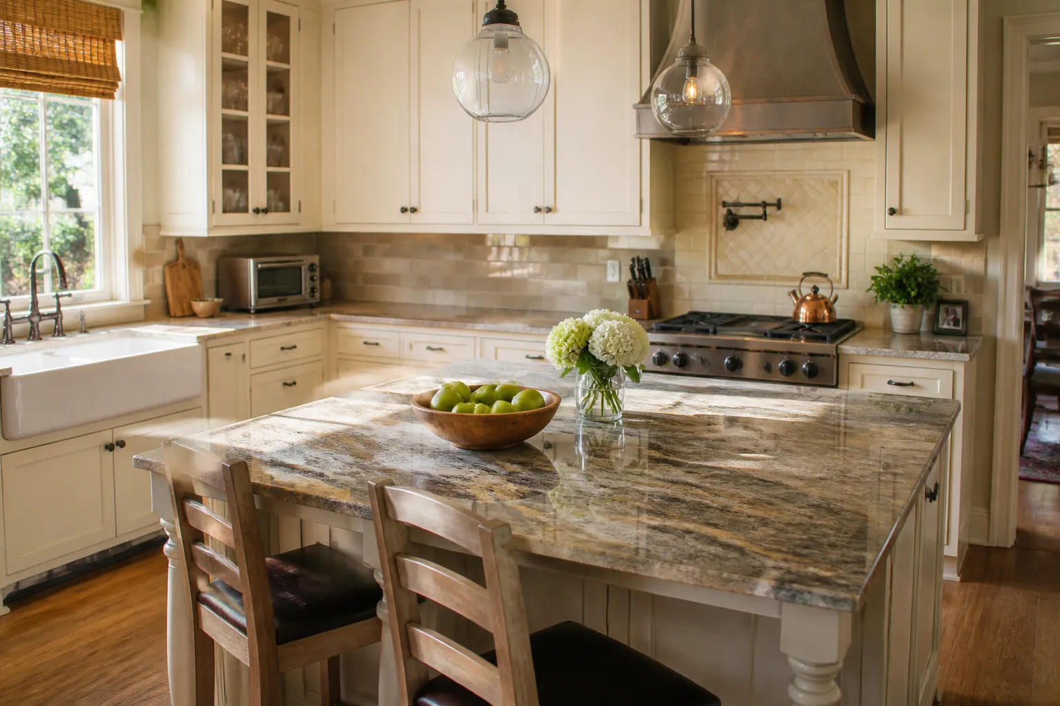
- White cabinets go with almost anything. Gray-veined quartz gives a clean look, and warm granite adds contrast.
- Wood cabinets often look best with a counter that picks up one tone from the grain, or a calm solid color that lets the wood stand out.
- Dark cabinets pop next to light counters. Dark tops on dark cabinets can make a kitchen feel heavy unless it gets a lot of light.
- Painted cabinets in colors like green or blue usually look best with a quiet white or soft gray counter.
Think about the whole room
Countertops sit next to floors, backsplash, hardware, and wall paint. If the floor has a busy pattern, a calm counter keeps the room from feeling crowded. If you want a bold tile backsplash, pick the tile after the slab, since there are more tile choices than slab choices.
Lighting matters too. Warm bulbs make stone look more yellow, and cool bulbs make it look gray or blue. Look at samples under the lights you use at night, not just in daylight.
A simple way to test a pairing
- Bring home a cabinet door or a paint chip of your cabinet color.
- Get the largest stone samples you can.
- Set them side by side where the counter will go.
- Look at them in the morning, afternoon, and at night.
- Take photos. Problems that are easy to miss in person often stand out in a photo.
If one pairing still feels right after a few days, it is usually a safe choice.
Get help comparing options
A full slab view can reveal movement that a small sample cannot. Marietta Countertops can help you compare countertop materials and combinations for a finished, balanced kitchen design.